A green dashboard doesn’t mean you have a healthy product. It only means the things you decided to measure are green.
There’s a pattern I keep seeing as systems and teams mature.
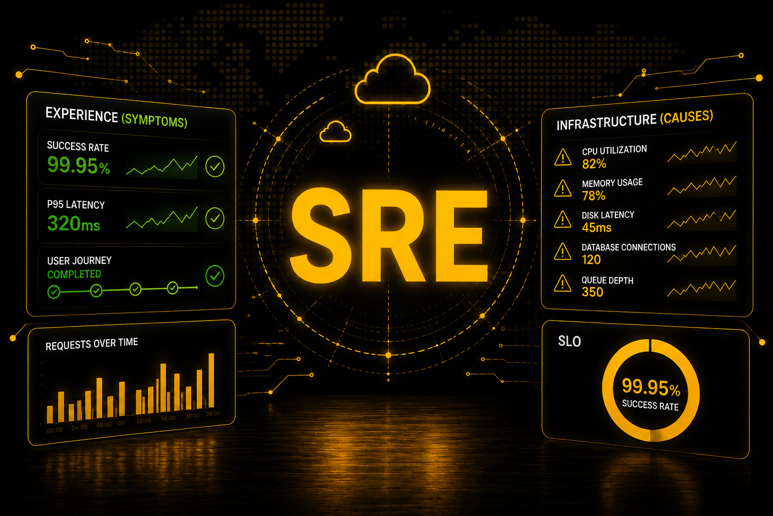
In the beginning, monitoring means monitoring everything. CPU above 80%? Alert. Memory above 90%? Alert. Disk latency increased? Alert. Database connections high? Alert. Queue depth growing? Alert.
Suddenly you have dozens — sometimes hundreds — of alerts watching every possible condition inside the infrastructure. And none of those metrics are useless. The problem is that we started monitoring causes before asking whether there was actually a symptom.
To be fair, that’s expected early on. A new product doesn’t know its own symptoms yet, so you instrument everything you can see and hope the important signal is somewhere in there.
That distinction matters more than it sounds.
Imagine your CPU is running at 99%. Is that a problem? Maybe. But what if latency is within expectations, requests are succeeding, customers are completing their transactions, and the system is behaving exactly as designed? In that case, 99% CPU might just mean you’re efficiently using the capacity you’re paying for. Even at 100%, scaling isn’t the automatic answer — it depends entirely on what the workload is supposed to be doing. A batch job saturating every core is a batch job doing its job.
Now flip it. CPU at 40%. Memory fine. Disk fine. Every infrastructure dashboard green. And your customers now need eight seconds to complete an operation that used to take one.
Which of those two should wake someone up at 2 a.m.?
Symptoms first, causes second
There’s an analogy I like here.
You go to the doctor for a routine checkup. They run a panel of tests and find one number slightly outside its normal range. You feel completely fine — no pain, no limitations, no symptoms. Does that number deserve a look? Possibly. Does it deserve emergency surgery tonight? Probably not.
Now imagine you walk in and say: “Every time I climb a flight of stairs, I get severe chest pain and can’t breathe.”
Now there’s a clear symptom. The doctor’s job becomes finding the cause. Heart? Lungs? Anemia? Something muscular? The symptom told us something is wrong. The tests tell us why.
Monitoring works the same way. The customer experience tells you about the symptom. Infrastructure telemetry helps you find the cause. The mistake is reversing the two — and it’s exactly the distinction Google’s SRE book makes between monitoring symptoms and monitoring causes, and why it pushes black-box monitoring that tests the system from the outside, closer to what the user actually sees. (Monitoring Distributed Systems, Google SRE Book)
The user is the aggregation layer
Let me be clear: I’m not saying stop collecting CPU, memory, disk, network, or database metrics. Quite the opposite. Those metrics are what let you investigate once you know something meaningful is happening.
But in isolation, a single metric rarely means anything. It becomes a signal when it lines up with others — latency rising and error rate climbing and queue depth growing, at the same time, on the same path. As a rule of thumb: if an alert can be expressed as one raw threshold on one resource, it’s usually a bad alert.
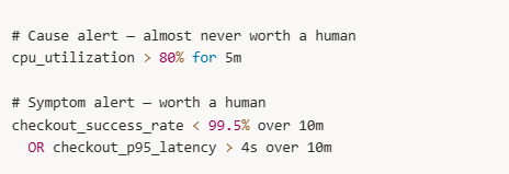
Same system. The first one fires on a machine. The second one fires on a customer.
Now think about a checkout flow that depends on ten components. You could build ten alerts per component and end up with a hundred alerts representing a hundred possible causes. What connects all of them?
The customer. The customer passes through the entire system.
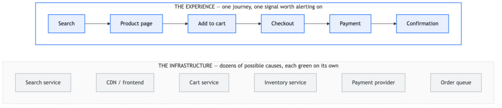
Every box in the bottom layer can be green on its own. Only the top layer knows whether the customer got what they came for.
That’s the experience. If customers suddenly stop completing that journey, dozens of explanations are possible: checkout latency went from one second to six, the payment provider slowed down, the inventory service is timing out, the database is saturated, a frontend change broke something, a network path degraded.
But before any of them, there’s something more important: customers are no longer completing the journey we expect them to complete. That’s the symptom. Now go find the cause.
That reframing changes the role of infrastructure monitoring. Instead of asking every metric “should I page someone about this?”, you start asking “can this signal help me explain a degradation in the experience?”
Very different strategy. Much smaller pager rotation.
What we can learn from Trivago’s experience (old, but gold)
There’s a published case that shows this better than any argument I could make. It’s from 2019, and it has aged extremely well — which is exactly why I keep coming back to it.
Trivago rolled out a new cloud service and watched it with both synthetic monitoring and real user monitoring across every region. One region came back negative on business metrics while the others were positive: the API there was responding slower, and users were bouncing more. (The Web Performance Impact Of Lossy Network Conditions, trivago tech blog)
The cause turned out to be nowhere near their application: packet loss on routers sitting between their CDN and their origin server — hardware they didn’t own, didn’t operate, and couldn’t instrument.
Your infrastructure can be perfectly healthy in your own region while users somewhere else have a completely different experience — usually because of something you don’t own.
Three things worth taking from that:
The detector was a business metric. No CPU graph, no memory alert, no health check was ever going to fire for broken routers on someone else’s network. The thing that said “something is wrong” was users bouncing.
The aggregate would have hidden it. The other regions were positive. One global number would have averaged the problem into invisibility. Experience monitoring only works if you segment it — by region, by origin, by whatever dimension your users actually differ on.
The cause lived outside the perimeter. You can’t instrument a router you don’t own. But you can always measure whether your users are succeeding — and that measurement points at the problem no matter which layer it’s hiding in.
None of this is automatic, though. Their own synthetic and RUM tests missed the intermittent outages at first — the checks were there, just not at a resolution that could see the failure.
That’s the actual work: simulate the real journey — log in, search, add to cart, check out — run it continuously from the regions your users live in, and assert the content, not the status code. “The server returned 200” is not availability. A page can load with empty results, wrong data, a broken checkout, or a response time nobody would accept. Check that search actually returned results, that the order actually got an ID.
Trivago’s failure was a broken router in 2019. Yours will be something else entirely, somewhere you’re not currently looking. That’s exactly why the lesson survives: the signal that caught it wasn’t measured inside the system — it was measured from where the user stands.
Mature systems get quieter
Something else I notice comparing young systems with ones that have been in production for years.
Newer systems are noisy. Alerts everywhere, constant paging, warnings appearing and disappearing all day. At some point engineers stop trusting the alerts — and an alert that’s routinely ignored is nearly the same as no alert at all.
As teams mature, monitoring gets quieter. Not because they observe less — usually they observe far more. Better metrics, traces, logs, dashboards. What changes is selectivity. They start separating two questions that were never the same:
What should I observe? and what should interrupt a human being?
You can collect thousands of infrastructure metrics while having only a small number of conditions capable of paging someone. That’s not laziness. That’s maturity.
Observe the infrastructure. Alert on the experience.
Traditional monitoring flows one way:

Better reliability thinking flows the other way:

Same telemetry. Completely different starting point.
That second flow is exactly what an SLI is: a measurement taken from where the user stands. The SLO is the line where “unusual” becomes “unacceptable,” and the error budget is what tells you how much of it you’re allowed to spend before reliability outranks the roadmap.
And that’s the whole distinction: something being unusual is not the same as something being unacceptable. CPU at 99% is unusual. A customer who can’t complete checkout is unacceptable. One is a potential cause, the other is a symptom — and the more mature your reliability practice gets, the better you get at telling them apart.
A green dashboard still isn’t health. It’s just the list of things you thought to measure, all agreeing with each other.
This week, pick your single most important user journey and write down what “unacceptable” means for it in a number. Then check whether anything in your monitoring would actually catch that. Reply and tell me what you found — I read every one.
Want to go deeper on SLIs, SLOs, and monitoring that reflects real user impact? Check out the trainings at mugnos-it.com.
Cheers,
Douglas Mugnos
MUGNOS-IT 🚀